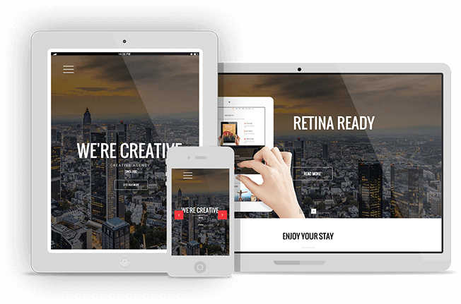
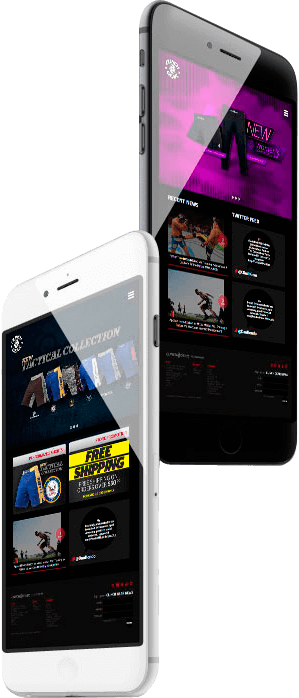
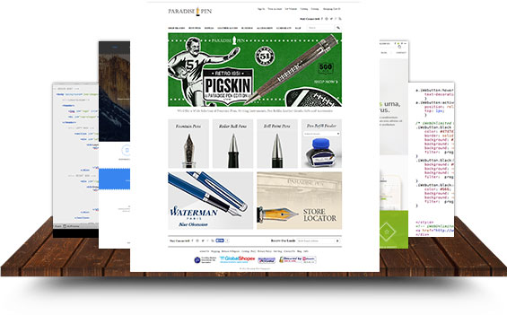
These days most sites are getting at least 30% of their traffic from mobile phones or tablets, with over 50% of their emails getting read on mobile. So naturally we need to consider how the website and emails will work for those users.
We have experience with the two main approaches and can help you decide what is best for your timeline, budget and overall user experience goals.

Responsive
What Does It Mean?
Web page will fluidly change and respond to fit any screen or device size.
Benefits
You have just one page with 4 different viewports depending on the screen size of the device -better consistency as perfect fit as you change from portrait to landscape on your mobile device or tablet, but...
Drawbacks
You have 4 different views to test and have to account for every element in the HTML even on the narrowest page - much more time intensive.
Adaptive
What Does It Mean?
The page adapts to the detected device, and can even go to separate web pages like an "M Dot" website - i.e. m.nike.com.
Benefits
You can have entirely separate html for just mobile screens and let desktop and tablet users see the same full resolution page - much easier to implement.
Drawbacks
You have two places to make changes, and your desktop site needs to be friendly to tablet users.
Optimized Marketing Emails
- Email optimized for iPhone, iPad, Android and Windows Mobile.
- Fallback HTML that renders beautifully on Outlook, Apple Mail, Gmail, Yahoo and Office365.
-
Experience with Deliverability Improvement, Inbox Delivery Monitoring, Sender Score Monitoring, SPF/DKIM Authentication and Domain Reputation Monitoring.


